Prita Tina Yeganeh
-
Scope
/ BRANDS
Brand Strategy, Visual Identity Systems, Typography, Messaging Frameworks, and Print & Packaging.
/ INTERFACESWebsite Design & Implementation
-
Client
-
Location
Brisbane, Australia
Prita Tina Yeganeh is a visual artist and community facilitator whose practice is shaped by lived experience, cultural inheritance, and long-form making. Developed through an active collaboration that centers the artist’s agency, her brand is an extension of her practice rather than a layer applied to it. It is shaped by the same values that guide her work: slowness, care, authorship, and responsibility to land, culture, and community. Every design decision functions as a carrier of meaning, reinforcing the ethics of her practice through form, structure, and restraint.
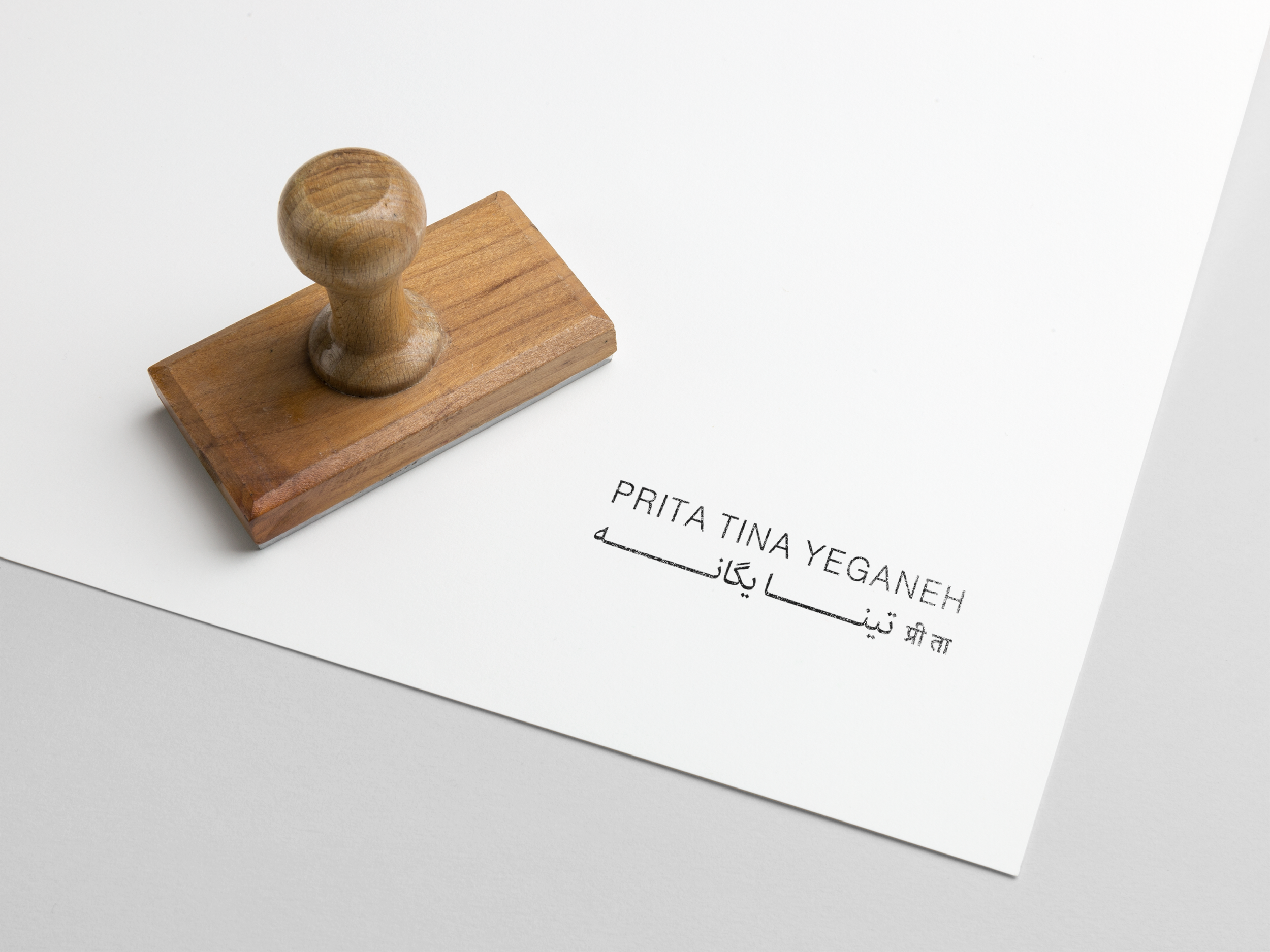
The artist leads the visual identity with a prominent trilingual logo—a primary carrier of meaning that centers her name in three languages as a direct reflection of her origin story and life experiences. These scripts function as a political reclamation of her backstory, framing her migration and lineage as foundational elements rather than ornaments. Typography is understated and measured, allowing the work, process, and acknowledgement to lead rather than compete for attention.
White space and pacing are central to the brand system. The website resists density and spectacle, creating room for reflection and breath. This spatial restraint mirrors Yeganeh’s durational approach to making, where time is an active material and absence is as considered as presence. Navigation remains simple and unobtrusive, prioritizing accessibility and legibility over performance.
The land acknowledgement has been refined as an internationalized gesture, positioned by the artist not as a formality, but as an integral part of the site’s architecture. Its prominence reflects an ethical stance, situating the work within ongoing Indigenous sovereignty and making explicit the conditions under which her practice exists as a refugee-migrant settler. This decision aligns the brand with accountability rather than neutrality, and with relationship rather than abstraction.
Imagery is treated with restraint and respect. Works are documented in ways that preserve process, trace, and material integrity, avoiding excessive cropping or enhancement. The brand does not seek to translate the work into a market-ready aesthetic, but to hold it accurately and responsibly, allowing viewers to encounter it on its own terms.
Across the system, the brand functions as a form of facilitation rather than self-promotion. It supports the work without speaking over it, and communicates authorship without centering ego. The result is a brand that captures Yeganeh’s commitment to cultural care, collective responsibility, and slow, relational practice, using design not as amplification, but as alignment.