Jouzy Healthcare Consulting
-
Scope
/ BRANDS
Brand Strategy, Visual Identity Systems, Typography, Messaging Frameworks, and Print & Packaging.
/ INTERFACESWebsite Design & Implementation
-
Client
-
Location
California, United States
Healthcare consulting is often communicated through neutrality: muted palettes, rigid systems, and emotional distance framed as professionalism. Jouzy Healthcare Consulting takes a different position. As a small, family-owned practice led by a husband-and-wife duo, the brand is built on the understanding that healthcare systems are human systems. Trust, care, and cultural awareness are not supplementary to expertise—they are the foundation of it.
The work positions cultural consciousness as a core competency. It reflects the reality of healthcare environments shaped by diverse communities, lived experience, and the nuanced, relational care that only a personal, boutique practice can provide.
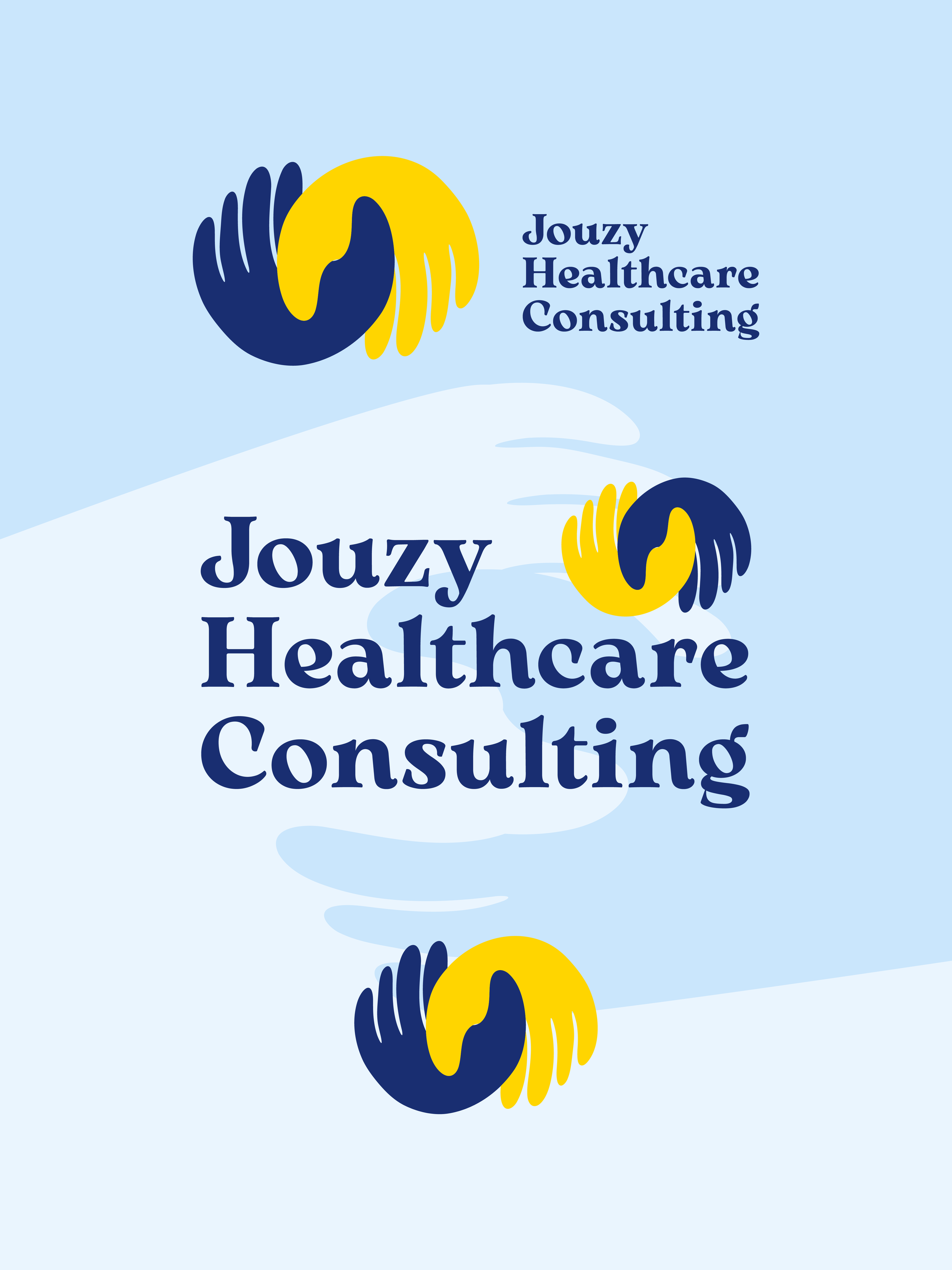
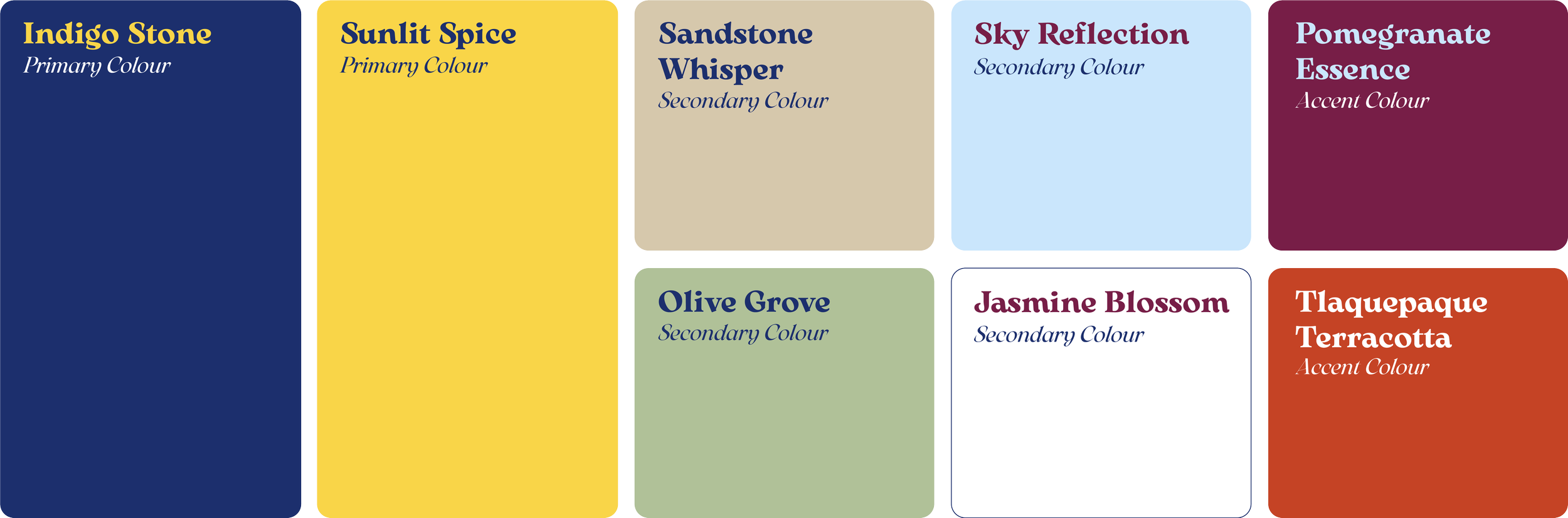
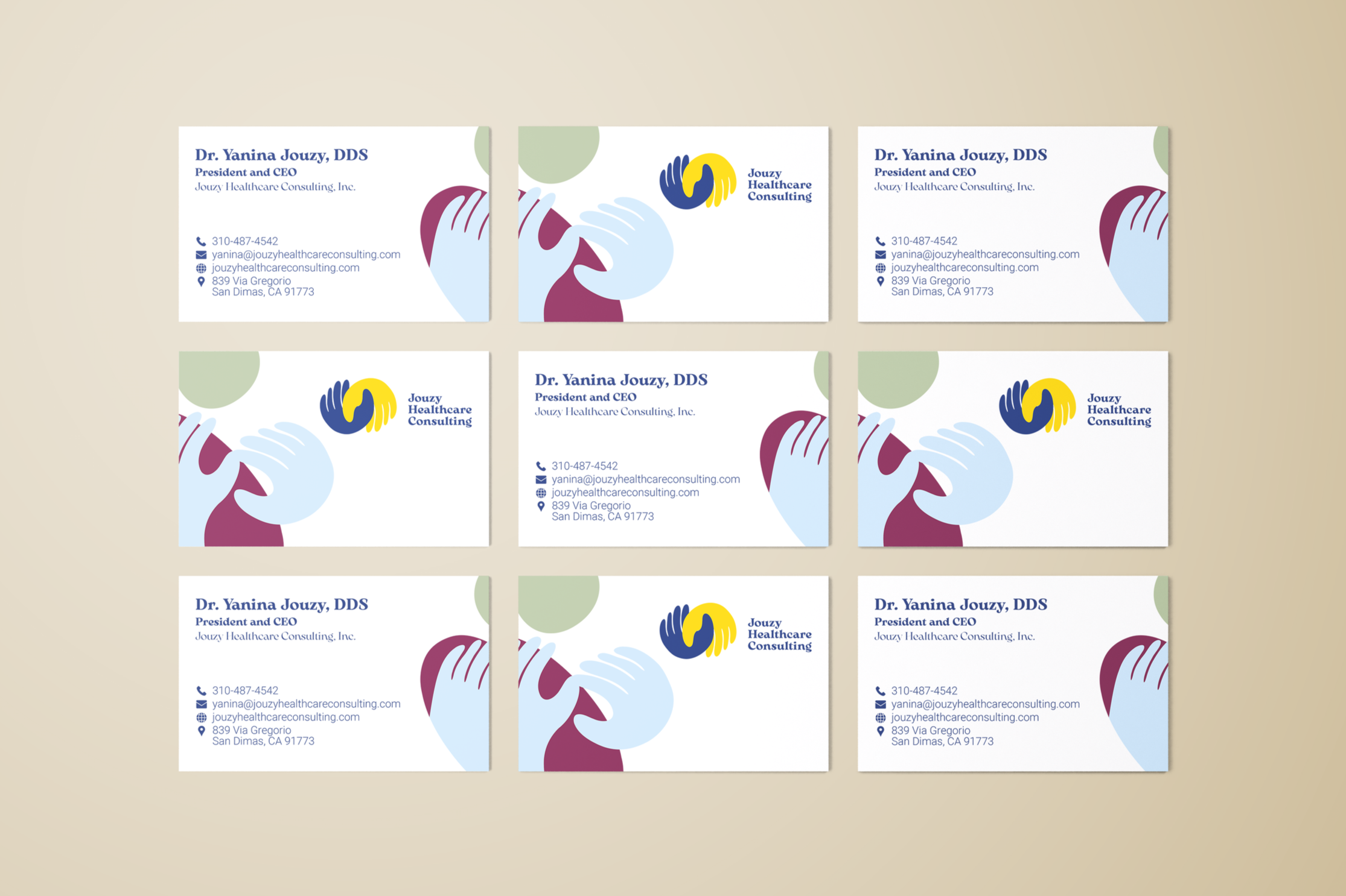
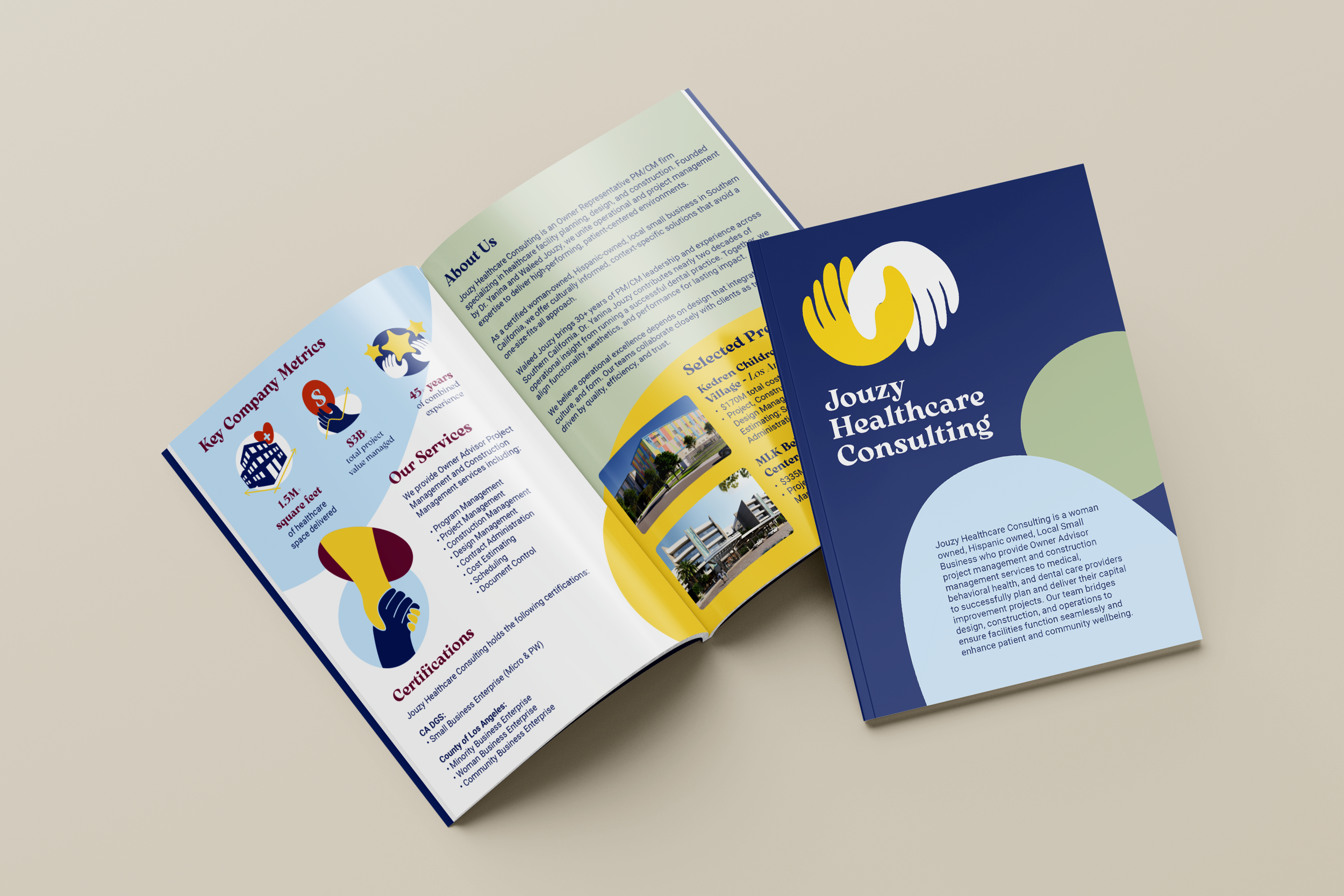
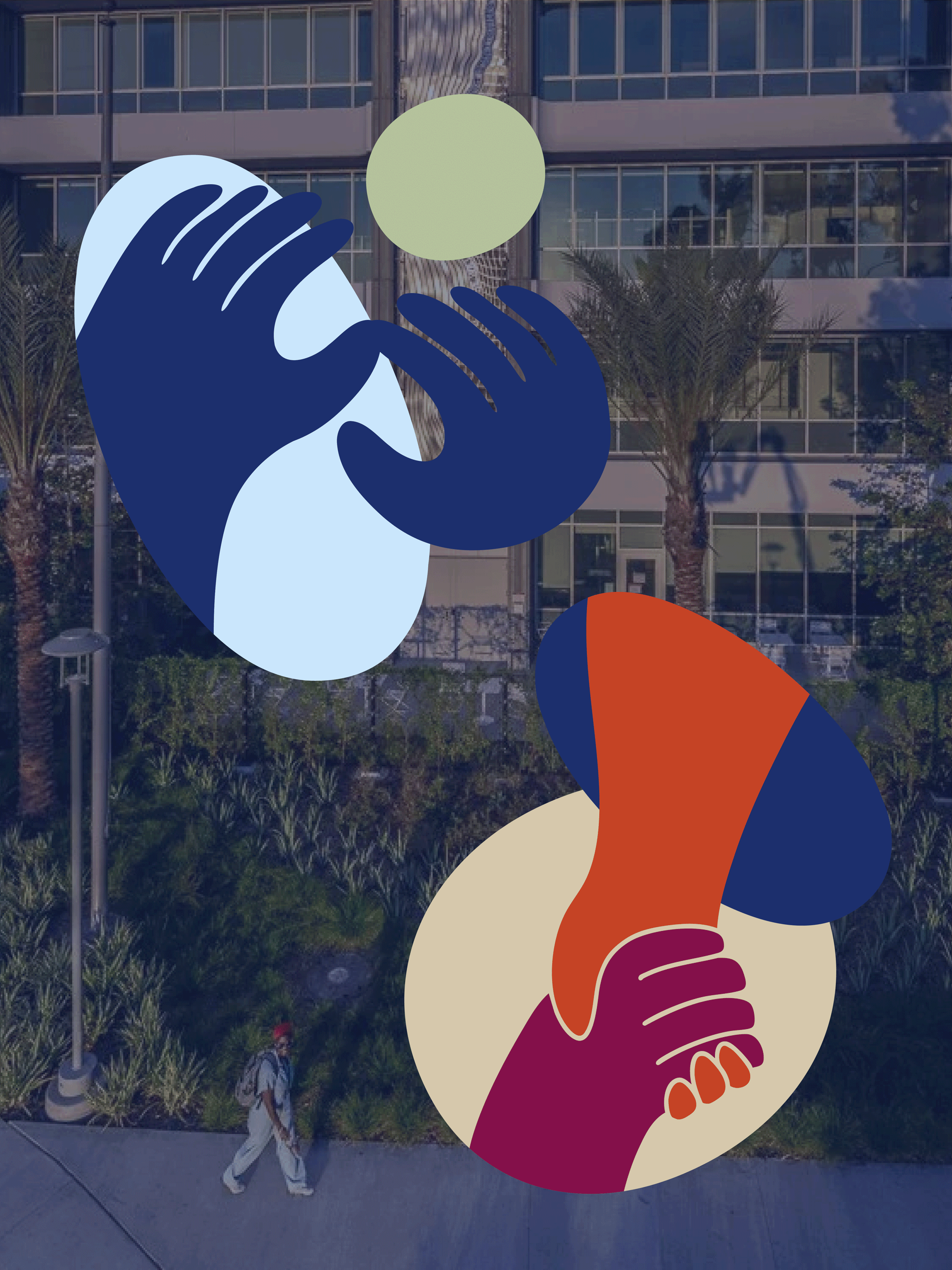
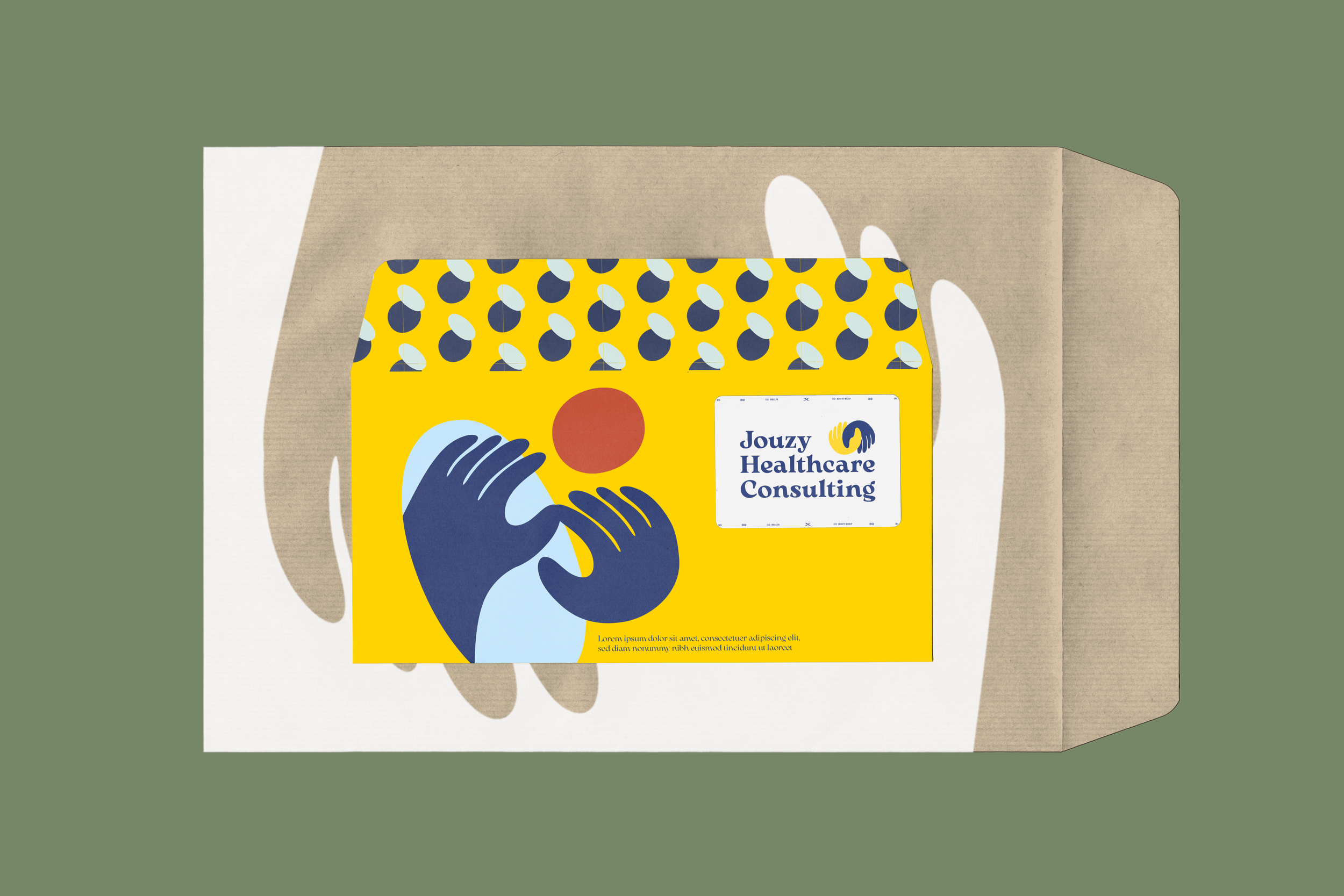
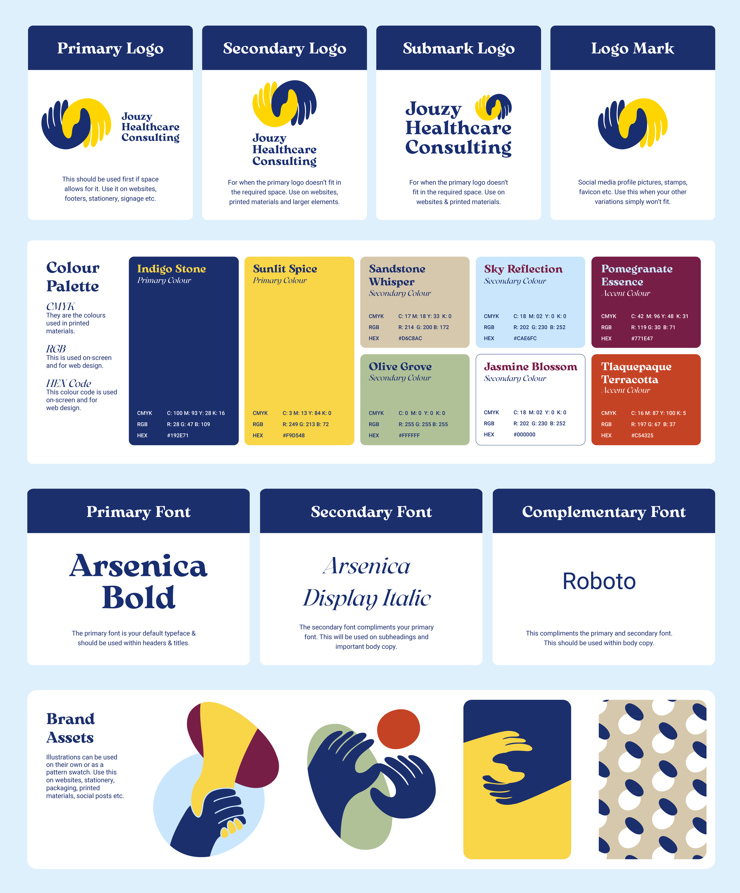
The visual language is intentionally bold and expressive, serving as a direct reflection of the founders' Palestinian and Mexican heritage. Rather than relying on standard corporate decoration, color is used as a signal of openness and energy. Bright oranges, yellows, purples, and reds introduce a sense of warmth and momentum, while muted greens and neutral tones provide the necessary balance, clarity, and structure. This palette reflects a consultancy that is active and engaged, rooted in a personal history that celebrates vibrant tradition while remaining grounded and trustworthy. Typography reinforces this balance; bold, chunky serif typefaces establish confidence and presence, while lighter, rounded typefaces for body text soften the overall system. This combination avoids the typical rigidity of the sector, allowing the brand to feel personal, accessible, and assured at the same time.
Throughout the identity, diversity and inclusion are emphasized through subtle, symbolic visual clues that reflect unity and collaboration. Instead of literal representation, hand-centric illustrations and abstract organic shapes reference the interconnectedness of care and the fusion of different cultural perspectives. These forms suggest that healthcare management is not purely procedural, but relational and adaptive.
Warmth does not replace professionalism here; it redefines it. The brand communicates competence through clarity rather than distance, and care through considered design rather than sentiment. Cultural awareness is embedded in the structure, tone, and visual decisions, resulting in a healthcare consulting brand that reflects the complex, people-driven, and culturally layered realities of contemporary care. Jouzy Healthcare Consulting presents itself as a trusted partner, rooted in community and committed to healthcare systems that recognize the human context behind every decision.