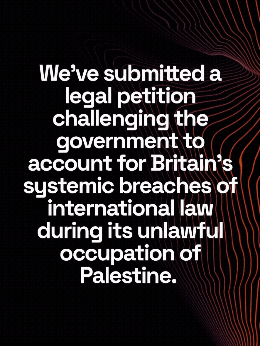
Britain Owes Palestine
-
Scope
/ BRANDS
Brand Strategy, Visual Identity Systems, Typography, Messaging Frameworks, and Print & Packaging.
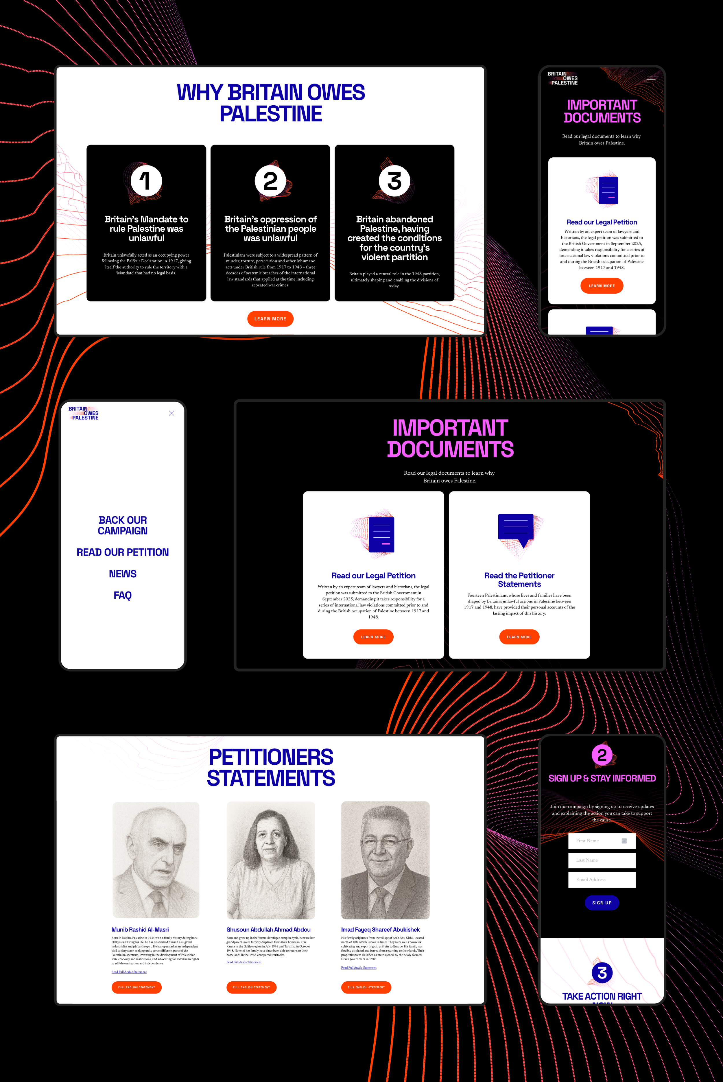
/ INTERFACESWebsite Design & Implementation
-
Collaborators
-
Location
London, United Kingdom
Borders are often presented as facts. Fixed, inevitable, and resolved. This project starts from a different premise: borders are designed. Drawn by hand, translated into systems, enforced through administration, and sustained through repetition. They are not neutral outcomes, but authored decisions with lasting consequences.
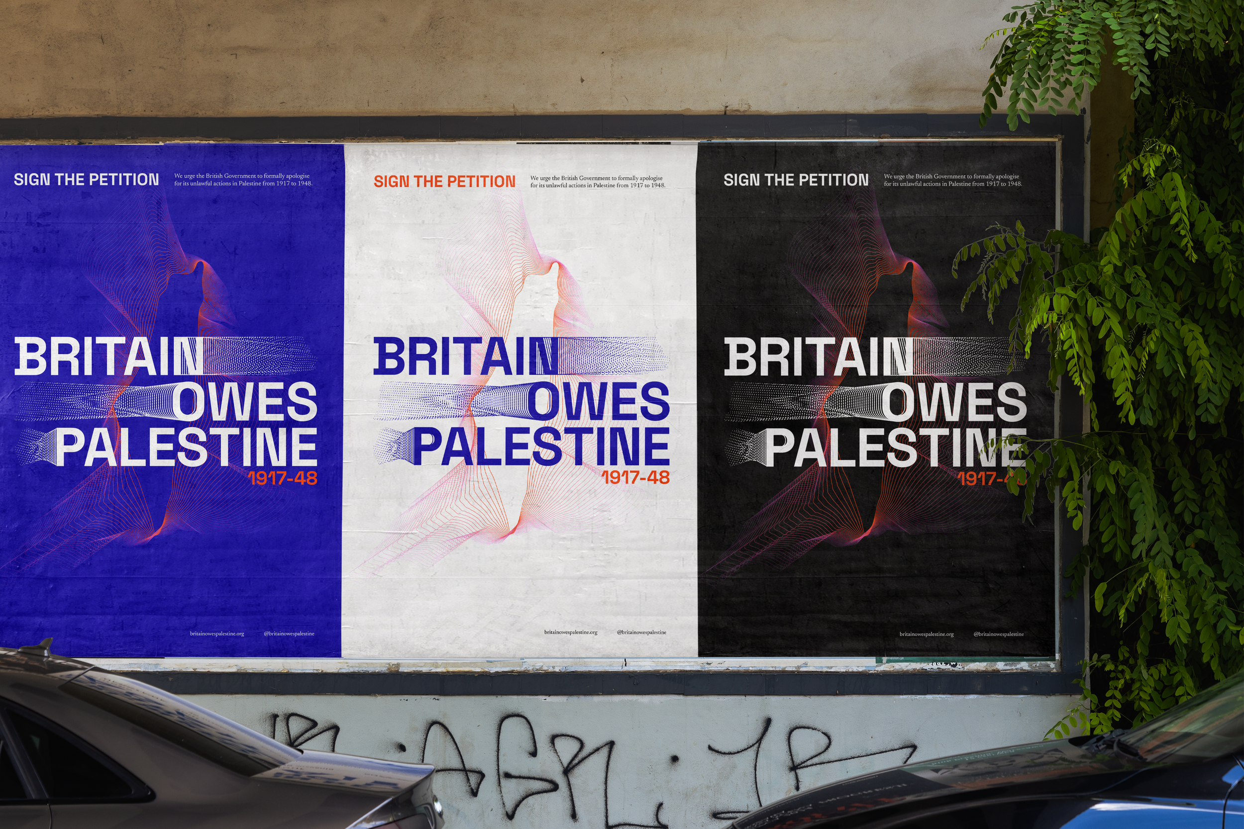
Britain Owes Palestine’s brand is built around a conceptual and visual inquiry into how British institutional design has shaped, legitimised, and preserved borders, specifically in relation to Palestine. Rather than reproducing political maps or territorial claims, the project reframes cartography itself as a design language worthy of examination.
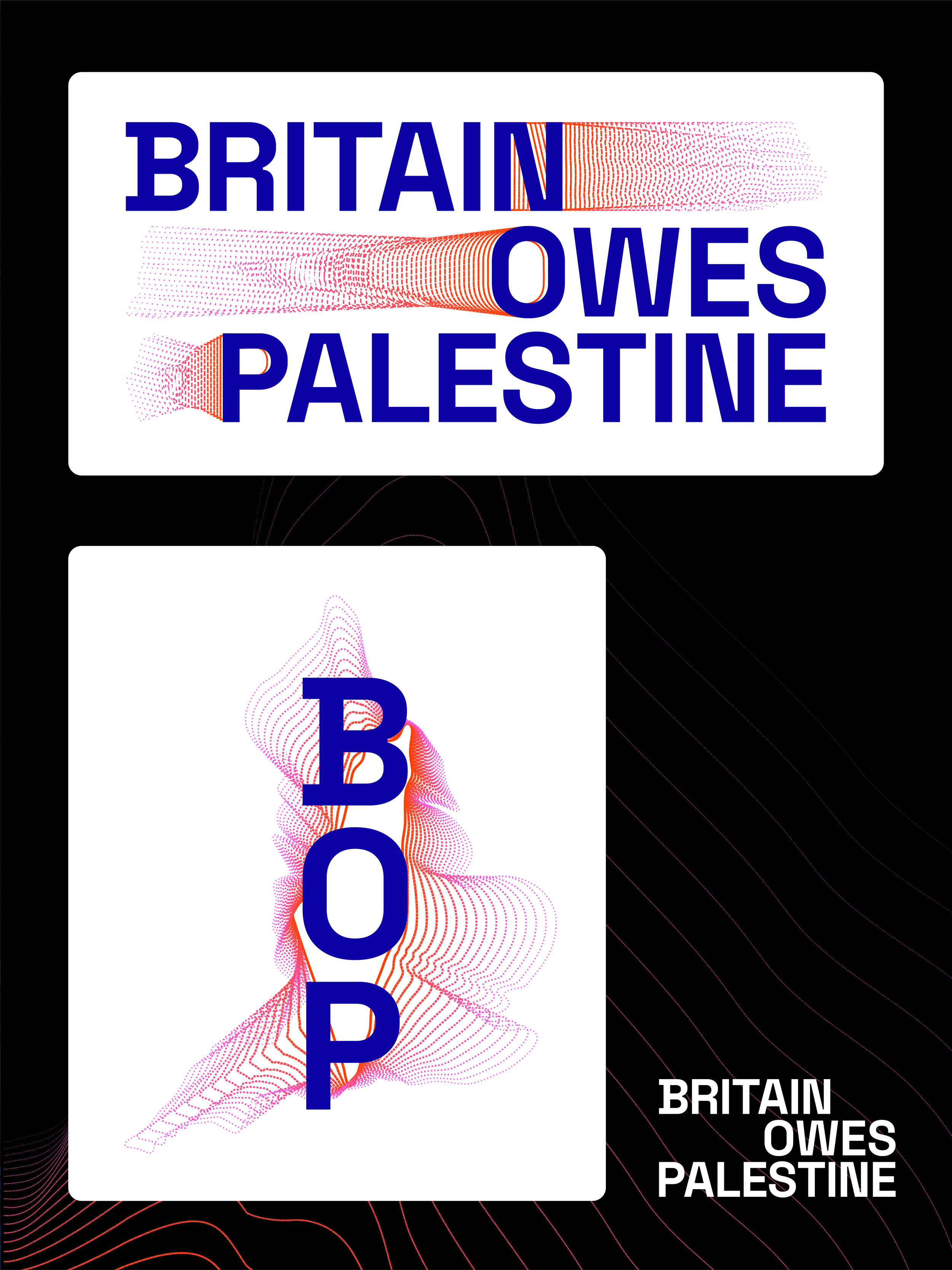
At the core of the visual system is a monoline contour blend of Britain and Palestine, generated through vector interpolation. The two landforms are not merged for harmony, nor overlaid for comparison. They are blended to surface continuity, tension, and legacy. This blended form becomes the backbone of the brand system. It operates less as an image and more as an organising principle, reflecting how borders are continually redrawn without ever fully disappearing. The line records movement, authority, and revision. It holds history without resolving it.
This is not cartography as representation. It is cartography as process.
The linework functions as a structural scaffold across the identity. Typography aligns with, interrupts, or resists the contour, producing moments of tension that mirror the narrative itself. Layouts are anchored by fragments of the blended form. Icons and marks are derived from the same linear logic, ensuring consistency without literal repetition. Rather than centring a single emblem, the system privileges behaviour. The line adapts, fragments, fades, and reappears, suggesting borders as actions rather than outcomes.
The visual language draws from British colonial-era mapping, archival stamps, administrative labels, and coordinate systems. These references are intentional, but softened. Ghosted lines, layered overlays, and partial forms evoke memory, distortion, and bureaucracy without reinstating authority.By abstracting these tools, the project creates space for critique without reenactment. The work remains grounded in British institutional aesthetics while refusing their claim to finality.
In motion, the line is never static. Borders draw in, dissolve, and redraw. This reinforces the central premise that borders persist not because they are natural, but because they are continually maintained. The system allows for structure without rigidity, and order without closure. Brand rules follow the logic of the line: precise, measured, and permeable.
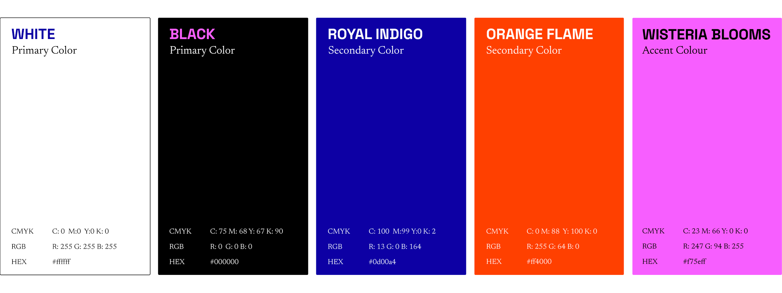
We leaned into a palette that feels undeniably "British," but we’ve pulled it into the present to create a sense of immediate, ephemeral campaign appeal.
Britain Owes Palestine’s visual language does not seek to correct borders by redrawing them. It seeks to expose how they come to exist, how they are legitimised, and how design participates in their endurance. The resulting brand is a restrained, deliberate brand language that carries institutional weight while questioning institutional authorship. One that invites reflection rather than reaction, and uses design not to decorate a position, but to make its construction visible.