Blatt & Matonelli
-
Scope
/ BRANDS
Brand Strategy, Visual Identity Systems, Typography, Messaging Frameworks, and Print & Packaging.
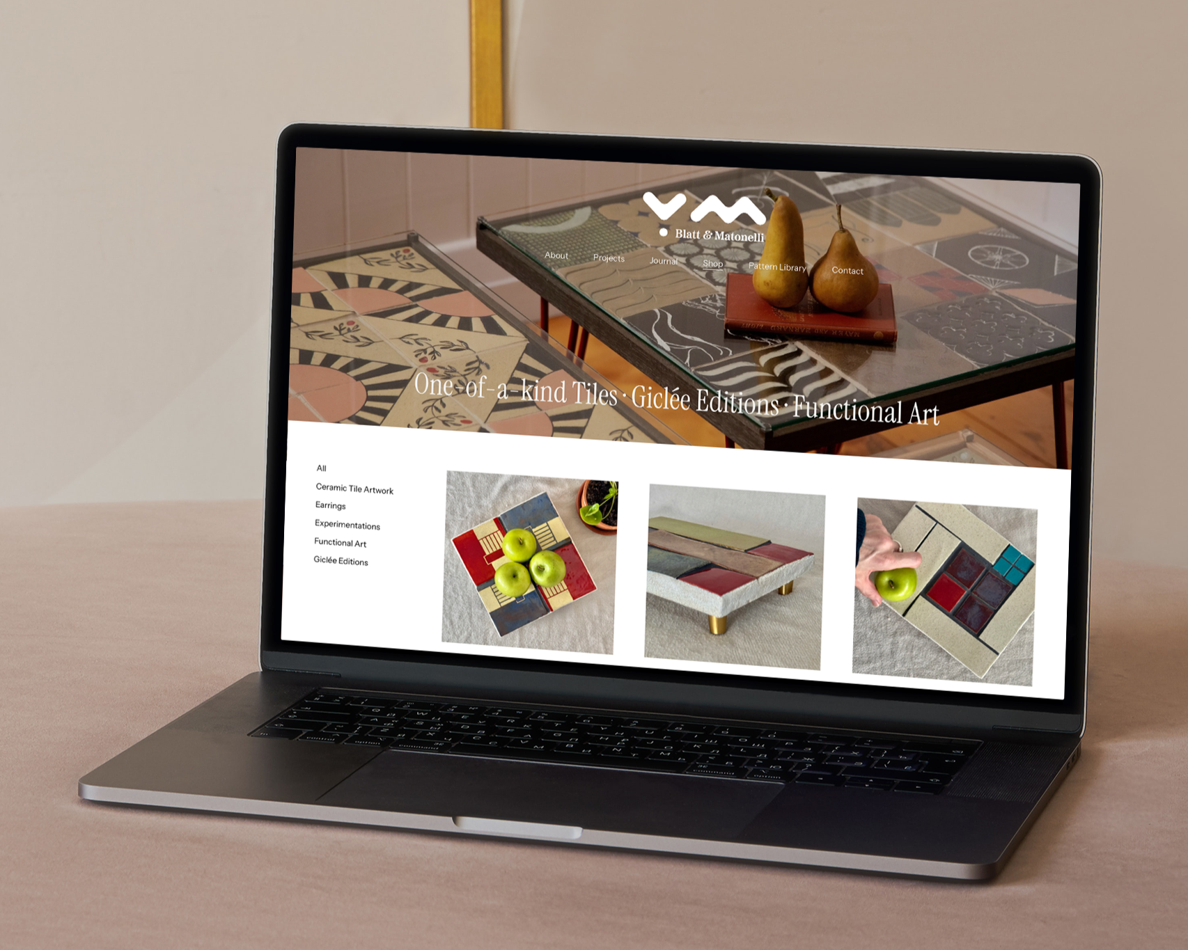
/ INTERFACESWebsite Design & Implementation
-
Client
-
Location
Brisbane, Australia
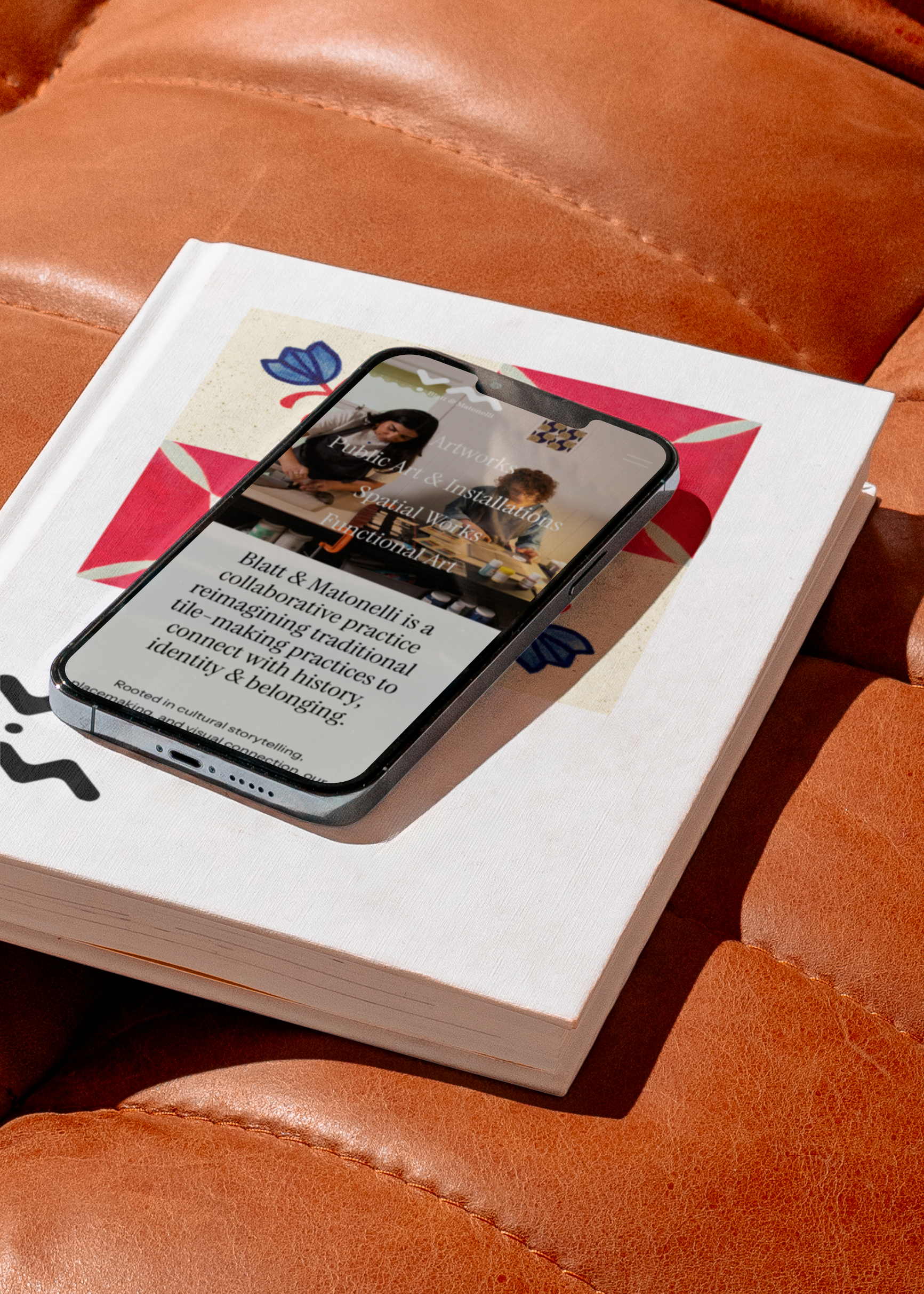
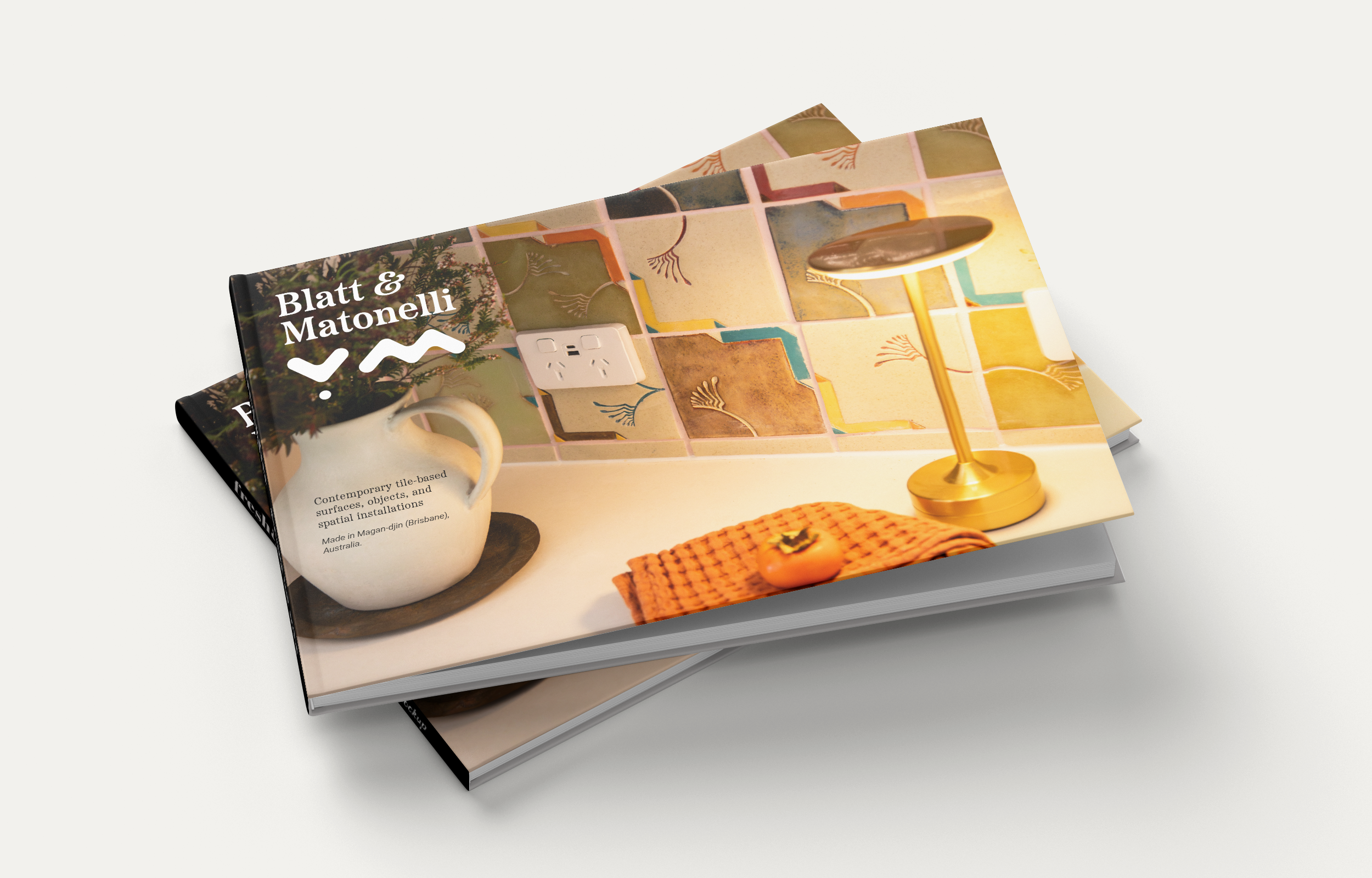
Blatt & Matonelli’s brand is designed to operate in service of the work rather than as its focal point. It functions as a holding structure, creating coherence, legibility, and continuity across a practice that moves between material experimentation, architectural scale, and cultural storytelling. Every design decision prioritises restraint, adaptability, and respect for the material and cultural lineages the collaboration engages.
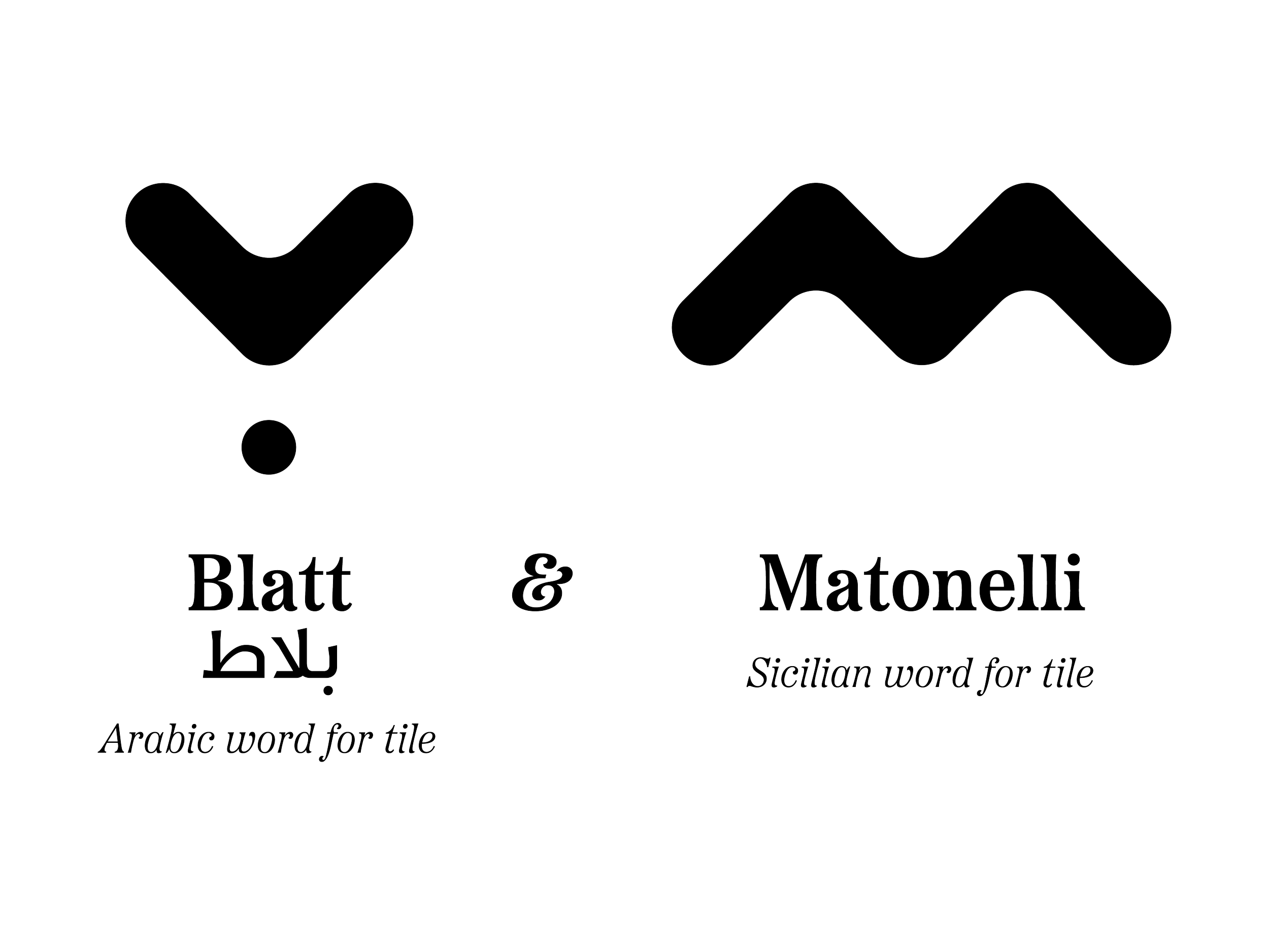
Blatt & Matonelli combines Arabic and Sicilian words for tile, immediately signalling plurality, migration, and shared Mediterranean histories without explanation or hierarchy. The name operates as a framework rather than a label, allowing multiple cultural references to coexist while remaining grounded in a single, legible identity.
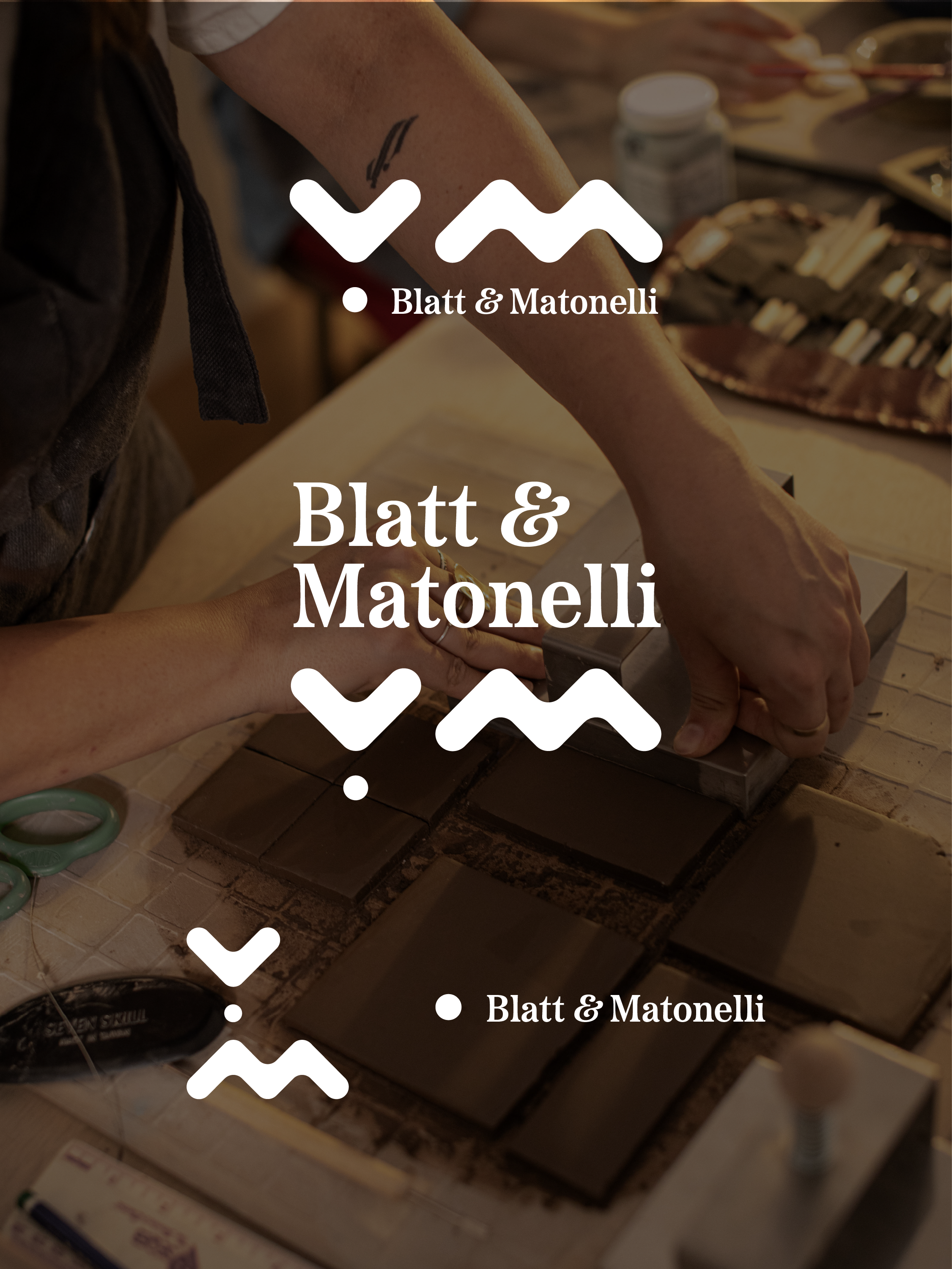
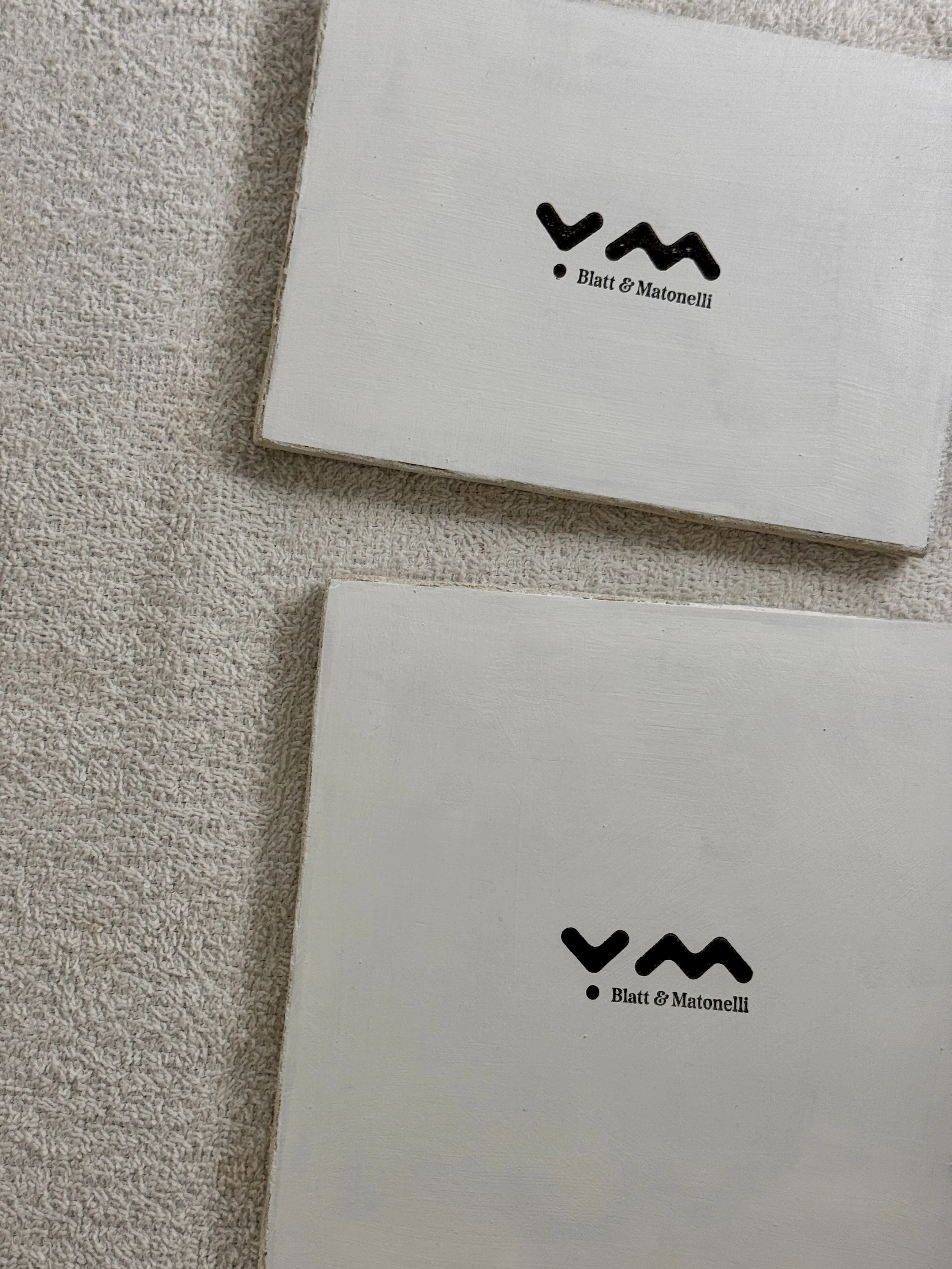
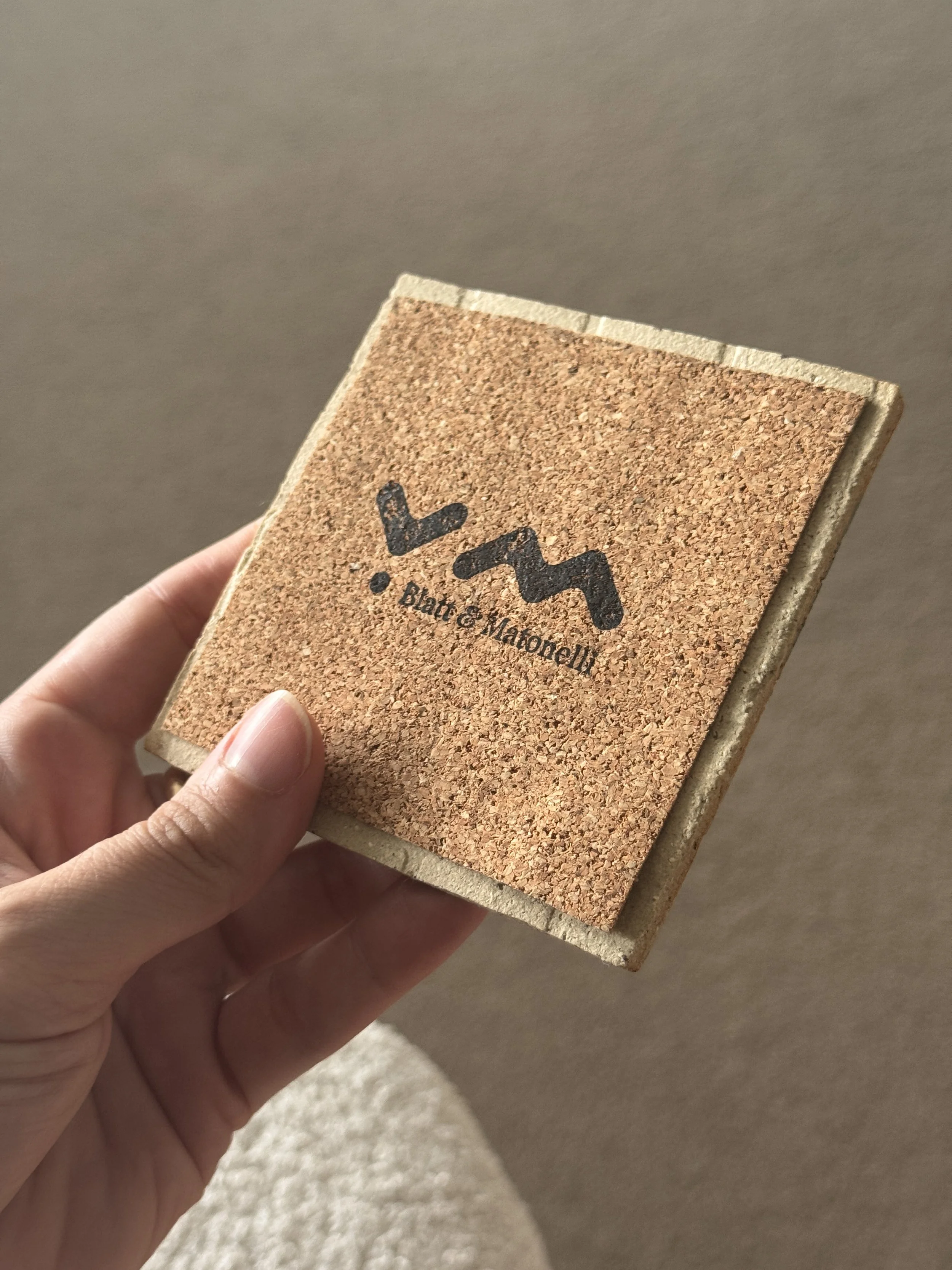
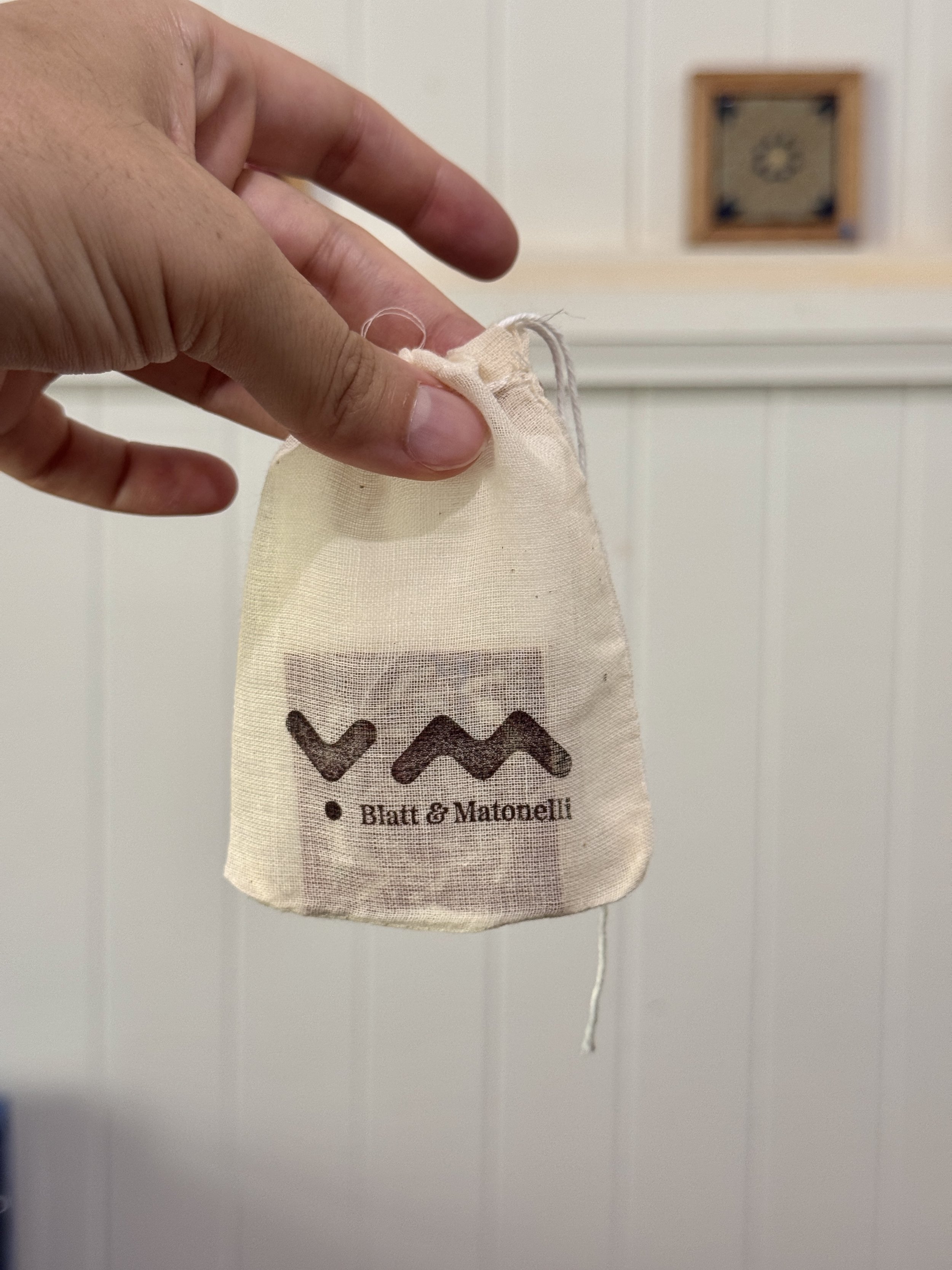
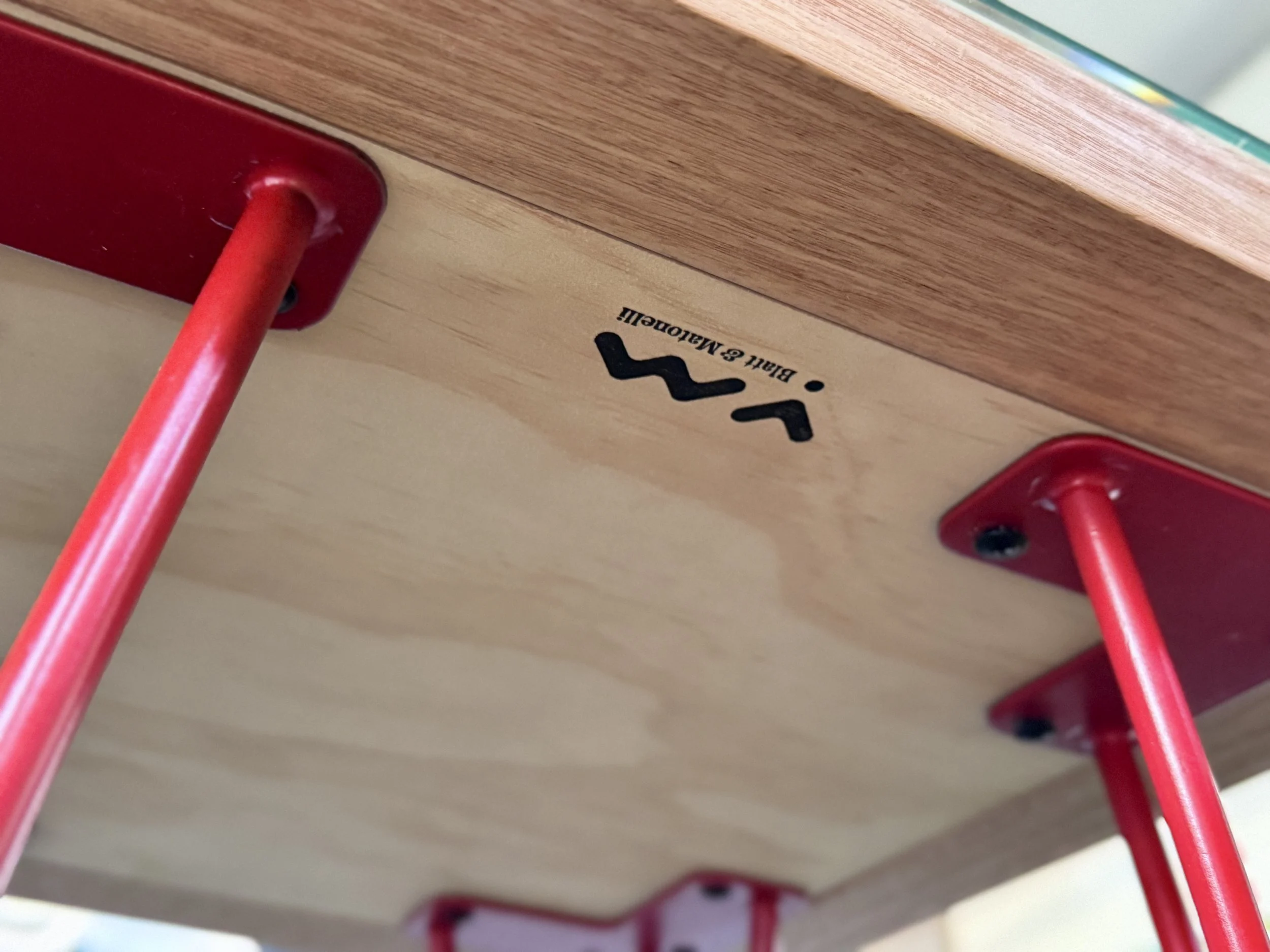
The Logo: Emblematic and intentionally minimal. It merges the Arabic letter ب with the Latin M, creating a mark that holds dual scripts and reading directions within one form. This is not treated as a decorative flourish, but as a functional device. Designed to be stamped, impressed, or repeated, the logo behaves like a maker’s mark rather than a signature, reinforcing authorship while leaving visual space for pattern, surface, and form to lead.
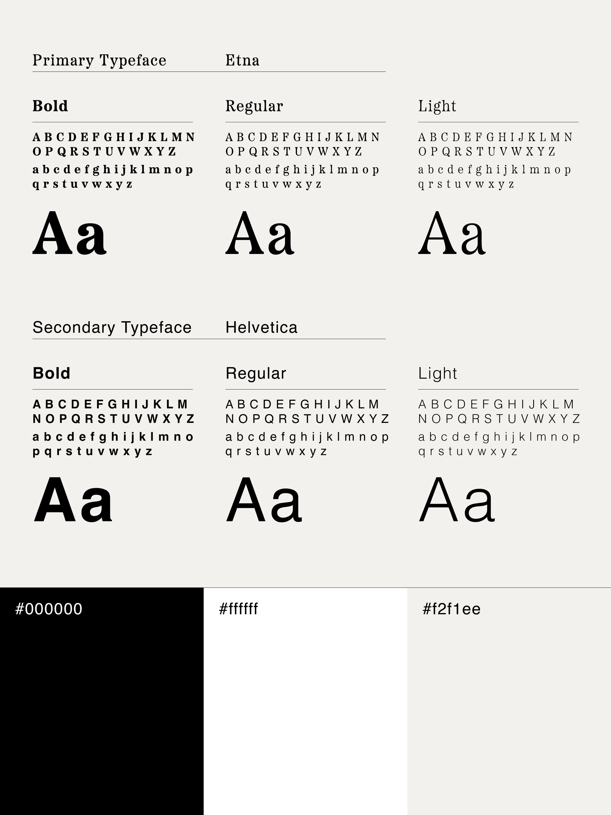
Primary Typeface: Chosen with intuition rather than defaulting to a modern sans-serif. It feels contemporary yet carries the profound weight of time, perfectly mirroring the enduring nature of the tiles while bringing a subtle, sophisticated ornateness back to the system.
Secondary Font: Built on timeless, standard foundations like Helvetica to maintain crisp structural clarity across applications.
The brand’s palette consists of black, white, and a warm off-white.
The off-white is chosen specifically for its warmth, avoiding the clinical feel of a stark, digital white.
Black is used to establish clarity, contrast, and reproducibility across contexts, while refusing to compete with the richness of the tile work itself.
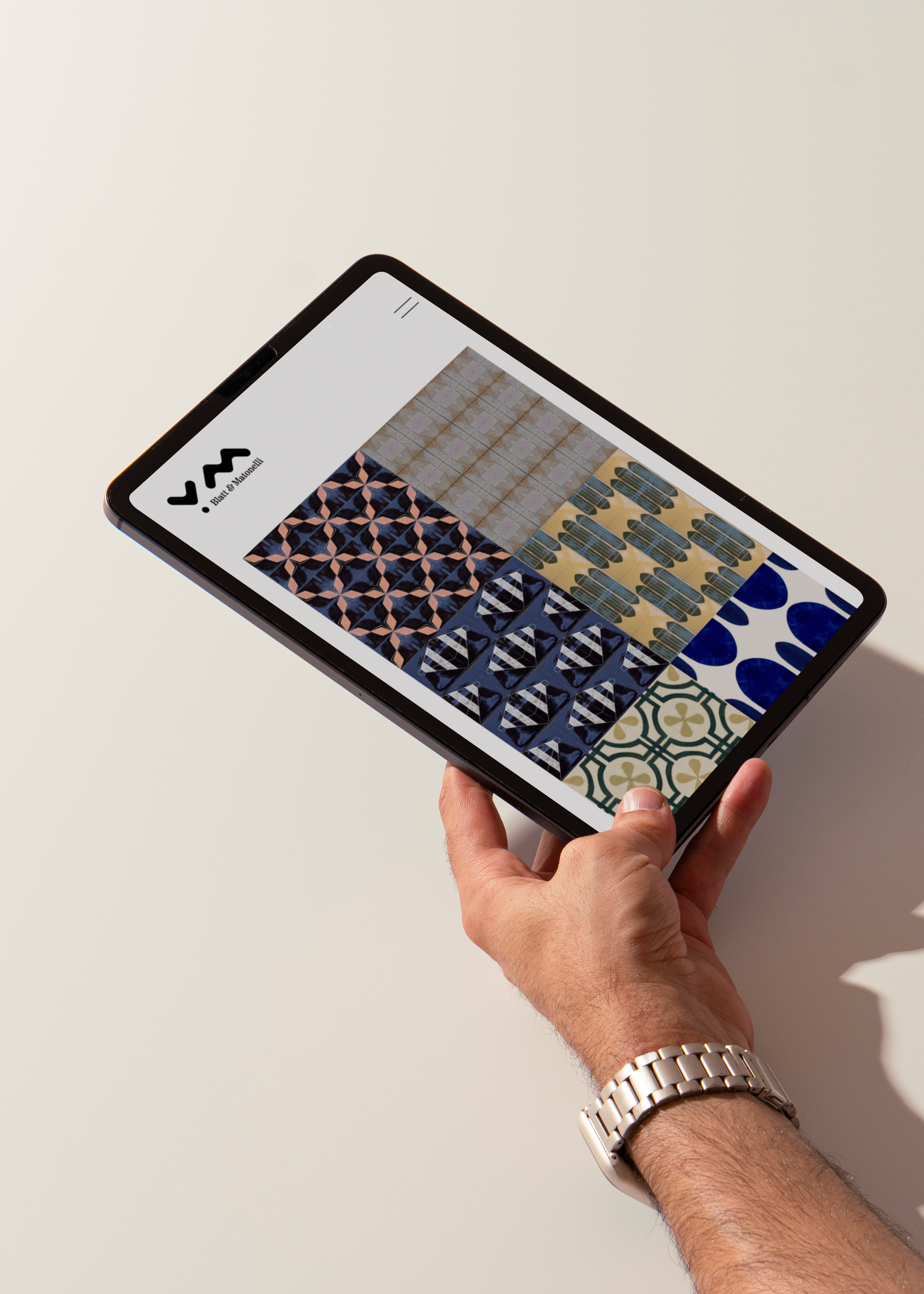
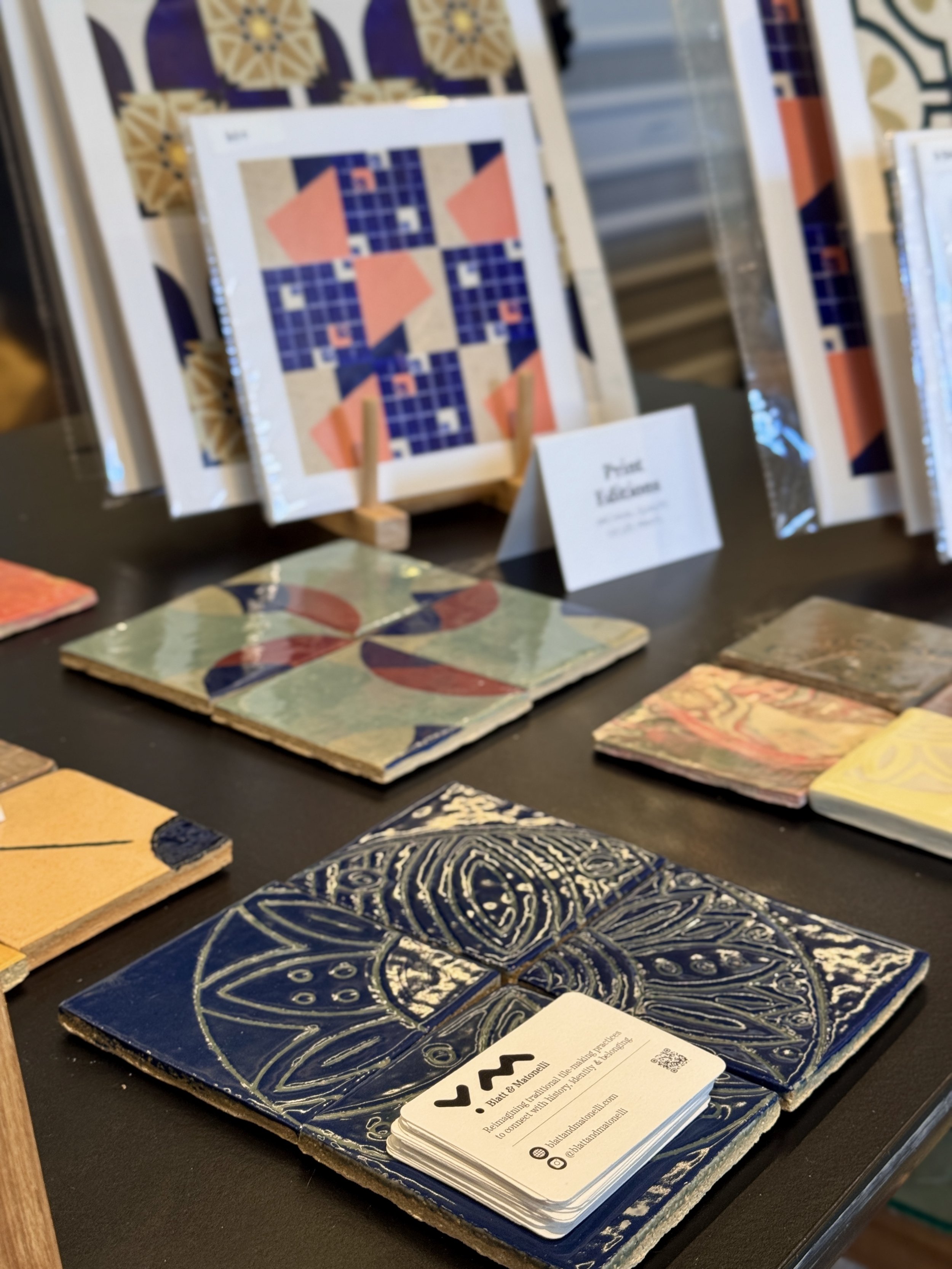
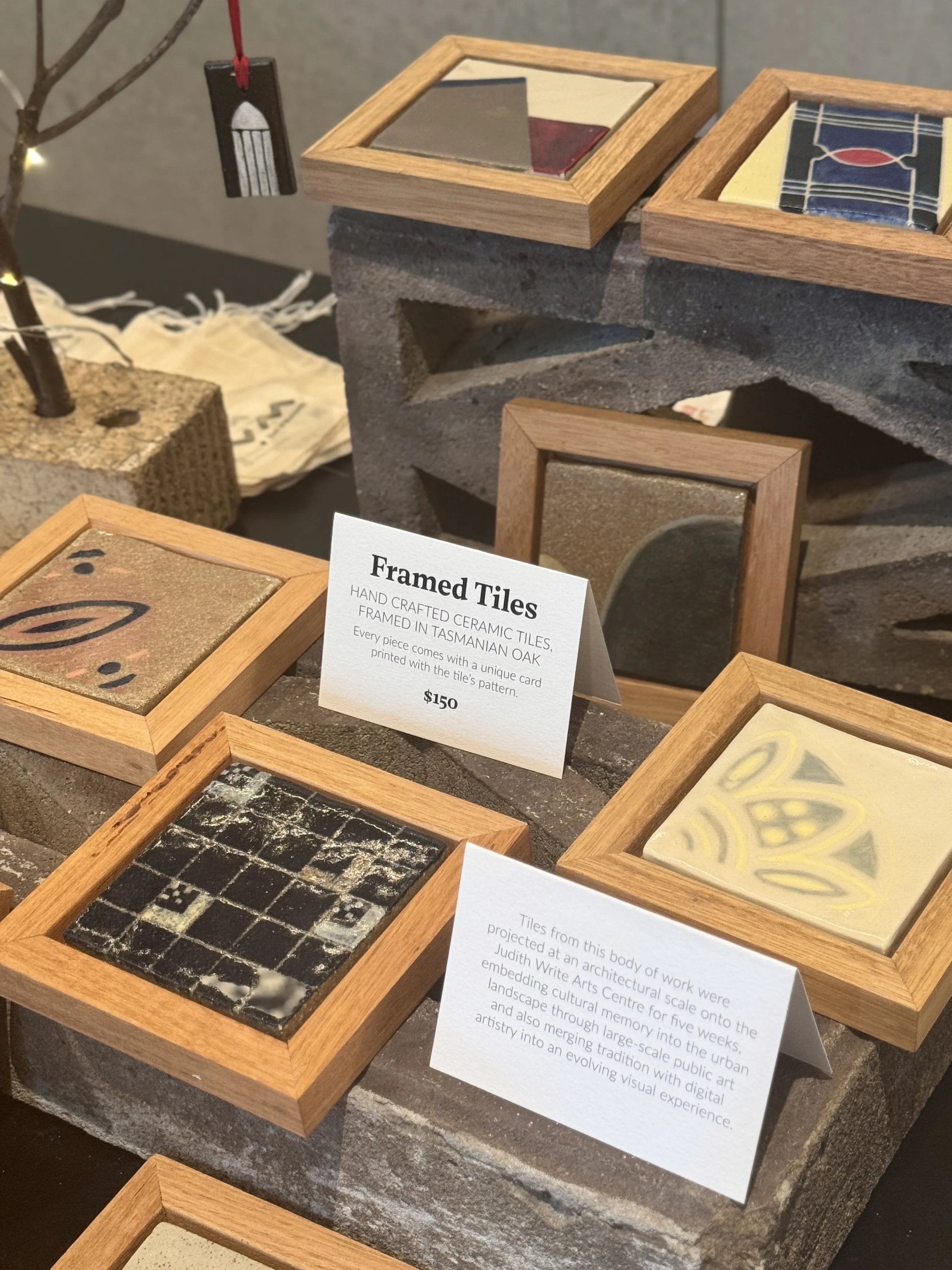
This restraint allows material outcomes, glazes, textures, and repetitions to carry visual emphasis, ensuring the brand supports rather than overrides the work.
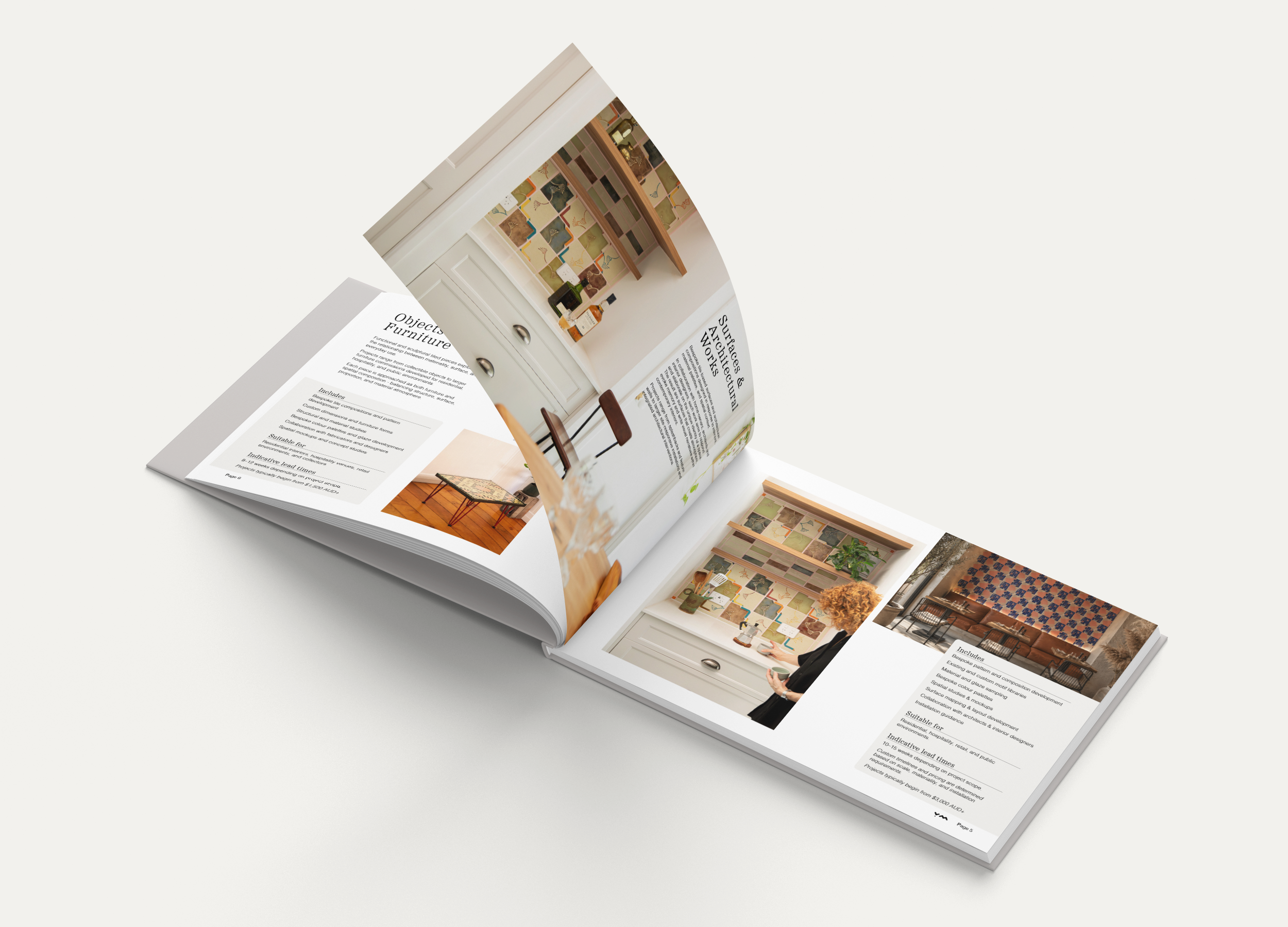
Typographic and graphic choices prioritize neutrality, balance, and structural clarity. The system is built to scale, functioning equally across small-format applications and architectural or urban contexts. It accommodates stamping, projection, and surface application, aligning the brand with processes of making, imprinting, and repetition rather than screen-based polish.
The brand system is intentionally flexible, capable of holding work that moves from individual tiles to large-scale installations. It provides consistency without prescription, allowing patterns and forms to adapt to site, scale, and context. In this way, the brand mirrors the logic of tile-making itself: modular, repeatable, and responsive.
By maintaining visual restraint and conceptual clarity, the brand allows cultural narratives to emerge through the work rather than being stated overtly. It does not aestheticise heritage or attempt to resolve identity. Instead, it creates the conditions for traditional practices to be seen, experienced, and reinterpreted within contemporary environments.
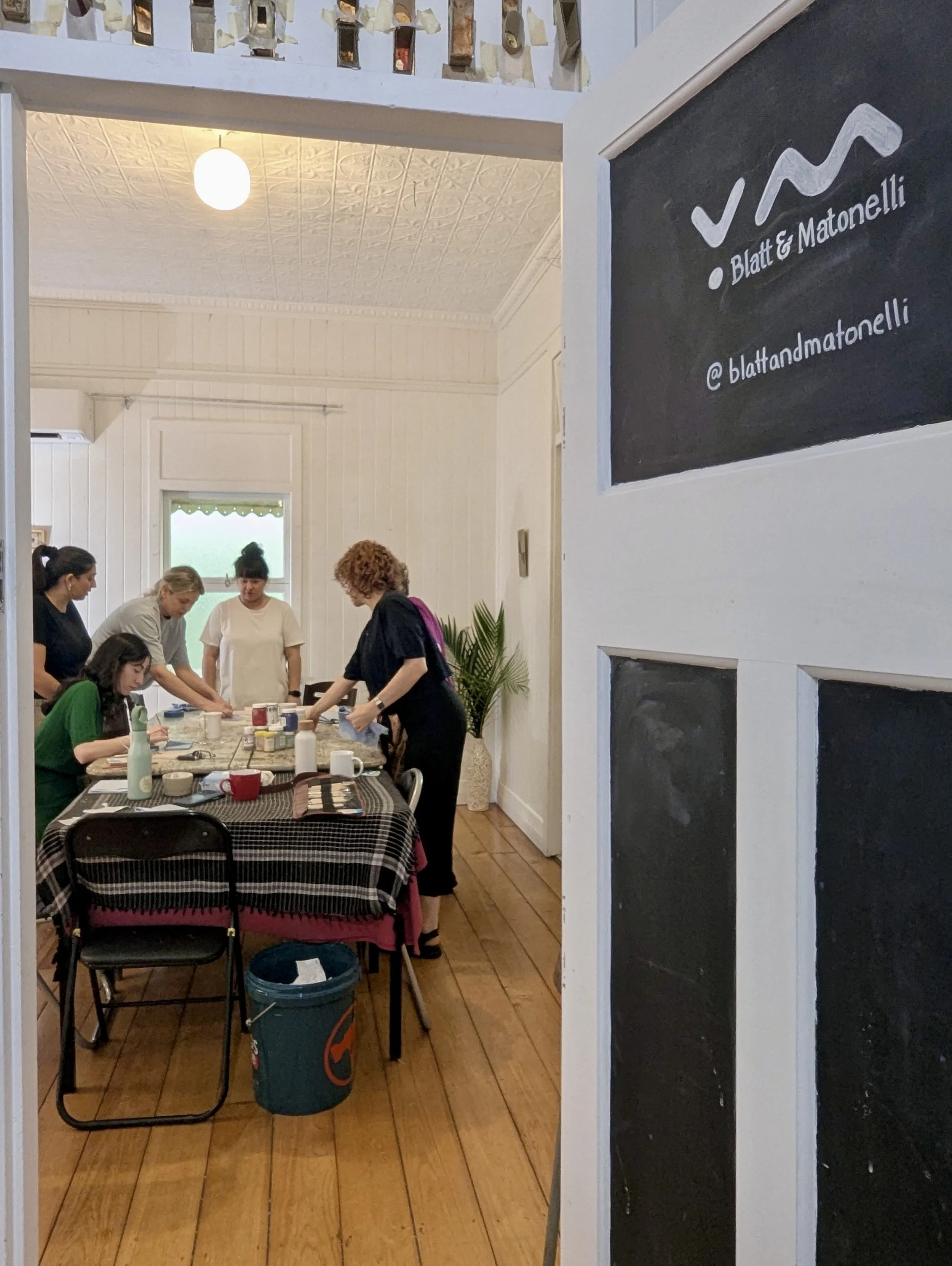
Blatt & Matonelli’s brand operates as infrastructure. It supports collaboration, shared authorship, and cultural continuity without asserting dominance. Through simplicity, adaptability, and considered absence, the brand holds space for tradition to evolve through use, repetition, and collective presence.